Digital Signage for Restaurants: Dazzle with Digital Menu Boards
by Tara Nichols
Digital Signage for Restaurants: Dazzle with Digital Menu Boards
by Tara Nichols
Digital menu boards, a critical component of restaurant digital signage, have become an essential feature of modern quick-service restaurants, food court vendors and other casual dining outlets. Research shows that digital menu boards increase unplanned purchases in restaurant settings by 80%. For restaurants and outlets that have taken the plunge and invested in digital menu boards, the next challenge is making them as effective as possible at attracting customers and driving sales.
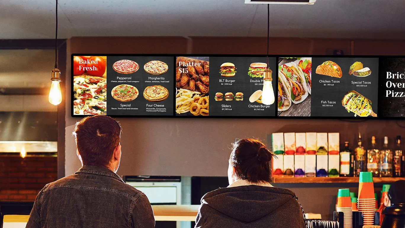
Here are several ways to dazzle customers with your digital menu boards, and create appealing content that attracts diners and increases average spend.
Choose high-quality images
While text-only digital menu boards have a place and can be highly effective due to their simplicity, the power of high-quality, attractive food imagery cannot be underestimated. High-quality photos are associated with high-quality products, so restaurants should consider investing in professional food photography to capture flattering and appetising images for display. Low-quality phone photography should be avoided at all costs.
Incorporate full-motion video
Moving content attracts the eye and adds interest to digital menu boards. Full-motion video is an excellent way to enhance your digital menu board content, and video is a proven tool to drive more awareness and sales as it is often the customer’s preferred content format. Research shows that 54% of consumers want to see more video content from brands, so video content is a worthwhile investment that could have a big impact on customer interest and restaurant sales.
Make digital menu boards easy to read
74% of customers say an easy to read menu is their top priority. Effective digital menu boards use large, clear fonts that are readable at a distance, and text must contrast sufficiently with the background to enhance readability. It’s also important not to try and include too much text, as this may crowd the design and make type smaller and harder to read.
Choose an effective colour palette
Depending on your restaurant brand, colour can have a big impact on customer attraction, as well as appetite. According to colour psychology studies, red and yellow are often touted as the chief food colours, as well as capturing customer attention. Orange is also a popular choice as it is thought to stimulate appetite, while green is often used to connote healthy food (for example, vegetables).
Clearly display prices and promotions
Clear prices are a key feature of any effective digital menu board, and lack of clear pricing information can make ordering frustrating for customers. Digital menu boards also offer an excellent opportunity to advertise combo offers and add-ons to increase average restaurant spend, and a portion of your setup should be dedicated to highlighting menu specials and restaurant promotions.
Drive more restaurant sales today with Scala digital signage for restaurants
Scala has helped many brands across the restaurant industry transform the customer experience with digital menu boards. Scala’s marketing technology and restaurant digital signage offers a bespoke solution that helps restaurants attract customers, drive sales and increase operational efficiency. Find out more here.
About the Author:
Tara Nichols,
