Scala Expert Guide: How to Create Impactful Digital Signage Content
by Scala Creative Solutions Team
Scala Expert Guide: How to Create Impactful Digital Signage Content
by Scala Creative Solutions Team

Make use of motion graphics for increased attention
Motion graphics are a fantastic way to grab people’s attention. When you walk past a screen and see something moving, it naturally makes you want to look. This is because our eyes are drawn to motion. By including moving images or animations in your digital signs, you can make your message stand out and effectively attract and engage viewers. But remember, it’s important to use motion wisely. You want to catch people’s eye without overwhelming them. Think about simple animations that can highlight your main message or show your product in action. This doesn’t mean you have to make everything move. Sometimes, just a little bit of motion can have a big impact, making your sign more noticeable and engaging for those who see it.
Maintain proper balance with moving elements
Since the human eye can only focus on one thing at a time, it’s crucial to ensure that your digital signage design strikes a balance with moving elements. When things move on the screen, it makes your content more eye-catching. But, it’s important not to overdo it so that you don’t overwhelm or confuse the audience. When incorporating features like videos, animations, or scrolling text, keep the movement purposeful and complementary to the overall message.
Too much movement can be distracting or even annoying for the people looking at it. Consider having a mix of static (non-moving) and dynamic (moving) parts in your design. The moving parts should highlight your main points or help tell the story of your brand, product, or service in a clear way. For instance, if you’re showing off a new product, a gentle animation that demonstrates the product in use could be really effective. This balance keeps viewers engaged without feeling overwhelmed. Also, remember that where the movement happens on the screen matters. Placing it strategically can guide the viewer’s eye to the most important information.

Use appropriate text structure for effective messaging
Ensure that your ad effectively conveys your message by using appropriate text structure. Think about how you organise your words; it makes a big difference in getting your point across. Remember, the goal is to convey your message quickly and efficiently. Choose simple, direct language that speaks to your audience without making them work to figure out what you’re saying. Using a clear message hierarchy helps viewers grasp the information quickly. Some quick tips for success:
- prioritise important content
- use concise language, and
- consider visual cues like font size and formatting to guide audience attention and understanding.
Create optical illusions with thoughtful screen placement
Consider the location of your digital signage screens as an opportunity to create designs that play with optical illusions. Clever placement of your screens can create surprising optical illusions that catch the eye and intrigue your audience. This method involves thinking about how and where your digital signage is seen by viewers. For instance, positioning screens so that the content appears to interact with the physical environment around it can make people stop and take a second look. To achieve this, consider the angles and perspectives from which your screens will be viewed. By strategically placing elements and using perspective, you can craft visually intriguing displays that captivate viewers and enhance the overall impact of your signage.

Optimise colour selection to enhance signage impact
When creating your signage content, choose colours that either complement the environment to seamlessly blend in, or contrast to make it stand out. Thoughtful colour selection can significantly impact viewer perception and ensure your message is both visually appealing and attention-grabbing. Additionally, colours can evoke emotions and influence perceptions, making it important to select a palette that aligns with your brand and message. Consider the psychological effects of colours and the context in which they are used for maximum effect.
Seasonal themes
Incorporating seasonal themes into your digital signage can make your content more relatable and engaging. As the year unfolds, so do various seasons and holidays, each bringing its own set of colours, images, and moods. By updating your digital signage to reflect these changes, you create an immediate connection with your audience. This could involve showcasing warm, vibrant colours in summer promotions or adopting a cooler, softer palette during winter. Remember, it’s not just about changing colours. You can also update your imagery, messages, and animations to match seasonal events.

Utilise negative space to direct attention
Using negative space wisely in your digital signage design draws viewers’ eyes towards the most important parts of your message. This intentional use of space around and between elements in your layout can dramatically enhance the clarity and visual impact of your content. By intentionally leaving areas of the screen empty, you can create visual balance and emphasis, ensuring that your key content stands out and captures attention effectively.
Use fonts thoughtfully
Selecting appropriate fonts is crucial for readability and ensuring your message is effective. It’s about finding the balance between style and functionality. Opt for typefaces that reflect your brand’s character whilst remaining clear and accessible to your audience. Choose fonts carefully to evoke specific emotions and establish the desired theme for your signage.
However, avoid overuse of font variations within a single design. Consistency in font selection makes content more readable and maintains visual cohesion.
Font size matters
Choose font sizes wisely for signage, with consideration for viewing distances. Aim for legibility from the intended distance. Recommended sizes range from 16 to 72 points, with 20 points or larger ideal for standard viewing distances of 10-15 feet.
Prioritise UI design on interactive signage
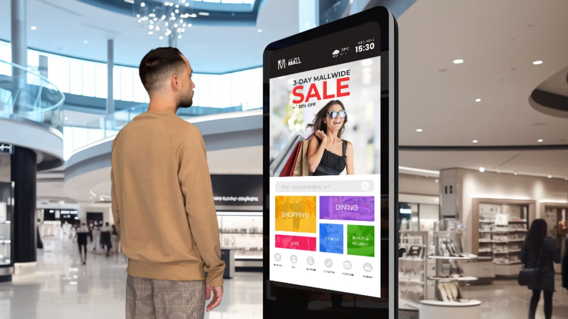
When it comes to interactive signage, user interface (UI) design is crucial. This means creating a layout that’s easy for people to navigate. Your audience should be able to find what they’re looking for without any confusion. Use clear, straightforward icons and buttons and make clickable buttons easily visible, reachable, and touchable for seamless user interaction. The design should be intuitive, allowing users to interact with the content effortlessly. Consider the touchpoints – areas on the screen users are likely to touch – and make these areas accessible and responsive.

Consistent branding
Adhering to a unified brand aesthetic across your digital signage ensures recognition and reinforces brand identity. It’s imperative to integrate your brand’s unique colours, typography, and voice consistently. This strategy not only solidifies brand presence but also fosters a sense of familiarity and trust amongst your audience, making your message more impactful.
It is important to keep your brand’s look and feel consistent across your digital signage. Use the same branded colours, logos, and typography to create a cohesive and professional look. When your digital signs match your overall branding, it helps people recognise and remember your brand better. This consistency builds trust and makes your brand seem more reliable and professional.
Consider timing for multiple ads on digital signage
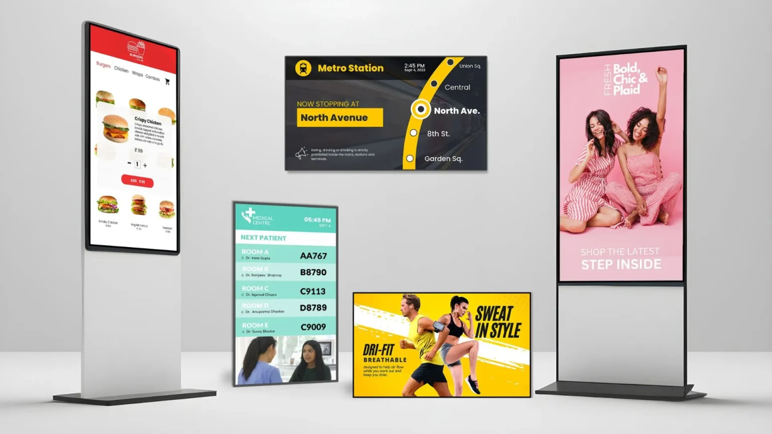
When planning multiple adverts or varied content on your digital signage, it is important to get the timing right. Consider the average time viewers will spend in front of your signage and use this to gauge how long each ad should display. Ensure readability by adjusting the duration of each ad to allow viewers enough time to read the full message before it transitions to the next content. Location plays a role, too. For instance, if it’s a location where people are on the move, like a metro station, shorter adverts with quick transitions might work best. On the other hand, areas where people tend to wait, like in queues or lobbies, can accommodate longer adverts and more detailed messages. Also, think about the relevance of each ad to the time of day or even the specific audience likely to see it at that time. This approach helps ensure that your content captures attention by delivering timely and engaging information to your viewers.
Incorporate icons in your designs
Enhance visual communication by integrating icons into your creatives. Icons are effective in conveying information quickly and succinctly, adding clarity and visual interest to your digital signage. They can guide users through your content, highlight key information, or signal actions on interactive displays. When choosing icons, it’s essential to ensure they are simple, recognisable, and consistent with your brand’s style.
Dynamic backgrounds
Encourage experimentation with dynamic background visuals, such as looping videos or animated patterns, to enhance the overall atmosphere of digital signage displays. Experimentation is key to identifying a style that complements your messaging effectively, drawing viewers in with a more immersive and visually stimulating experience.
Incorporate live content
Live content on digital signage brings dynamic and real-time information directly to your audience, ensuring that your messaging remains relevant and engaging. Whether it’s live news updates, social media feeds, real-time event schedules, or weather forecasts, integrating live content into your digital signage allows you to capture attention and provide valuable information that keeps viewers informed and entertained.
About the Author:
Scala Asia-Pacific’s Creative Solutions team are experts in taking digital signage to the next level with creative and engaging content and design solutions. They are the masters of bridging creative imagination with technology and intuitive digital signage and UI/UX design. They share tips and creative insights to optimise your digital signage and maximise results.


