Top Tips for Designing Attractive Digital Signage Content
by Scala Team
Top Tips for Designing Attractive Digital Signage Content
by Scala Team
The answer for many companies is content. Our answer is that content strategy should always come first. Content strategy should influence your digital signage solution. Then, after the strategy is laid, and the infrastructure built, THEN we turn to the content itself.
Great content is the key to successful digital signage. It spells the difference between achieving your goal, or ‘audience indifference’ — where your audience doesn’t see your message or, worse, ignores it.
The biggest challenge in designing effective digital signage content is capturing your audience’s attention. This means your content must be attractive, memorable and relevant.
According to Sixteen:Nine, you have two to three seconds to capture your customer’s attention. Then another five to seven seconds to deliver your message. Here are some important tips to make those seconds count

1. Design with the correct resolution and aspect ratio
Stretched, distorted or blurred images on a digital screen look unprofessional and can damage the perception of a brand.
For optimum display, the resolution (pixels per inch or PPI) and aspect ratio (the width of an image in relation to its height) of your images and video should be equal to those of the actual digital signage screen being used to display the content. The most common commercial screens are full HD (1080p) and measure 1920 x 1080 pixels in landscape mode or 1080 x 1920 pixels in portrait mode.
Set up your design layouts to match these dimensions exactly, and your content should display well on your screens.

2. Choose high quality, eye-catching images
The human brain processes image 60,000 times faster than text, and 90 percent of information transmitted to the brain is visual. While there are questions about the numerical accuracy of this statement, there is no denying that humans process visual data more easily than text. What this means is that your images matter.
Some general rules:
- Choose high-quality and attention-grabbing images to use in your digital signage content
- Source your images from high-quality stock photo libraries
- Avoid clipart at all costs, as it can look cheap and unprofessional, and avoid downloading from Google Images as you may find they are blurred when blown up to the proportions of your screen.
Like incorrect resolution and aspect ratios, poor quality images used in your digital signage can reflect badly on your brand.
3. Choose the right font and text style
The right font depends on what message you want to send to your customers. However, here are three rules of thumb that can be applied to any design:
- Never use more than two fonts in a single design
- Large text and bold lettering can help improve readability
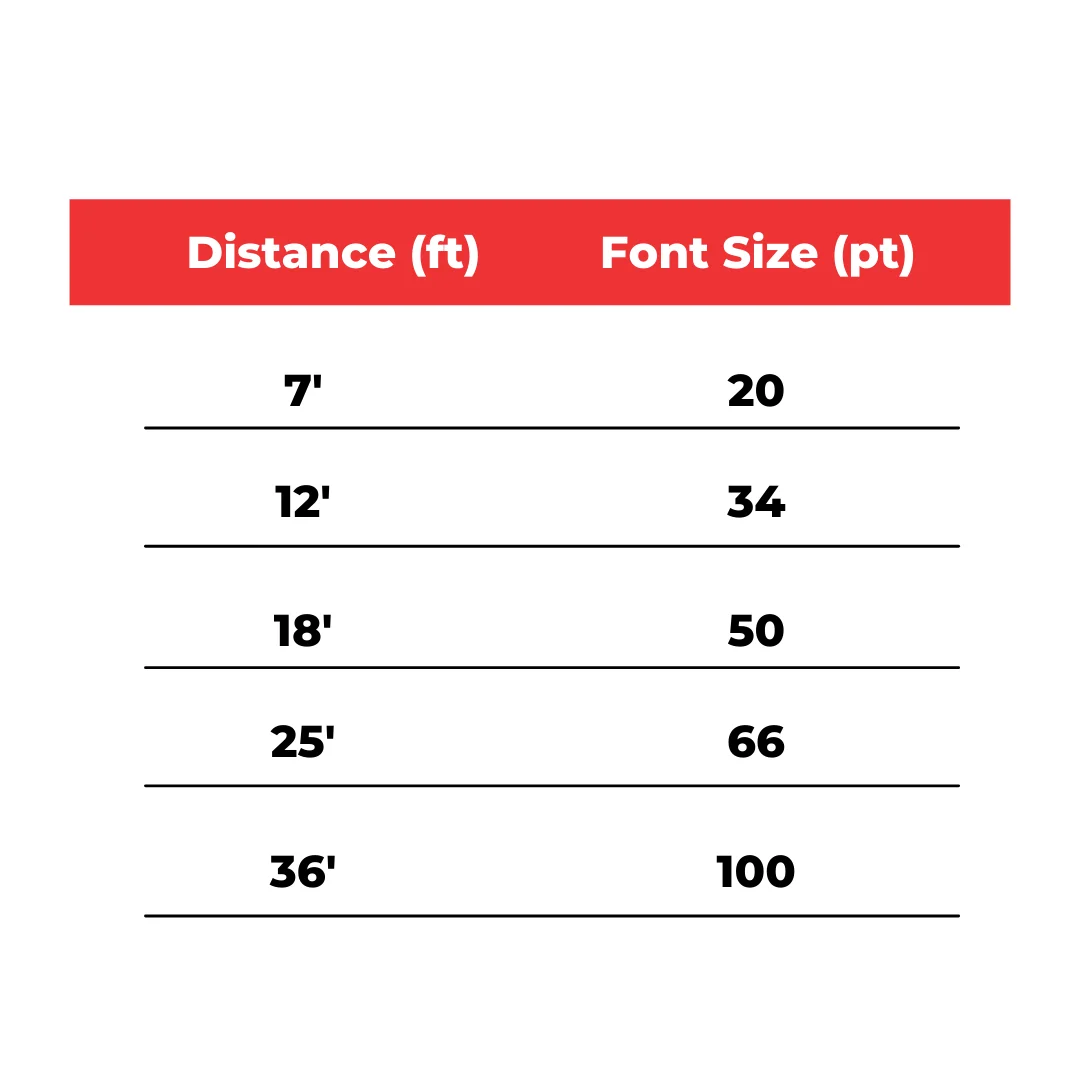
- Keep the type size large for readability at a distance, as most digital signs are viewed from a distance. As a rule, a 20 to 30 point font can be seen from 7 feet away.

4. Ensure sufficient contrast and legibility
Contrast is essential to producing readable content for your digital signs to effectively communicate your message. For text, this means that there must be effective contrast between the text colour and the background for it to be readable. The rule is that contrasting colours work best: use light on dark or dark on light.
5. Be aware of colour meaning and perception
Colours can convey powerful subconscious messages, and their meaning can also vary greatly depending on culture. Consider choosing colours that are:
- Appropriate for your message;
- Aligned with what you are selling or trying to convey; and
- Resonates with your target audience.
- Red: Excitement or danger
- Blue: Trust and credibility (corporate)
- Orange: Warm and vibrant (commonly used in food/beverage/QSR settings)
- Yellow: Cheerful, happy
- Green: Peace, health, growth
- Black: Superiority, control
- White: Purity, Cleanliness
Yellow is one of the first colours that the human eye notices and can be used to attract attention (for example, a yellow sign with black text), or as an accent.
Another important factor that plays into colour selection is placement of your digital displays. Think about where the displays are located and what the natural environment is around that display. Is it in a bright area? A dark area? If outside, how will the sun change visibility over the course of the day? These considerations should influence the contrast and colour of your content.
6. Employ focus techniques
In digital signage design, focus techniques are used to control the impact of information. The aim is to guide the eye to critical information first and create a visual hierarchy in your design. Here are some rules to consider:
- Headlines, graphics, bright colours, and high contrast items will attract the most attention
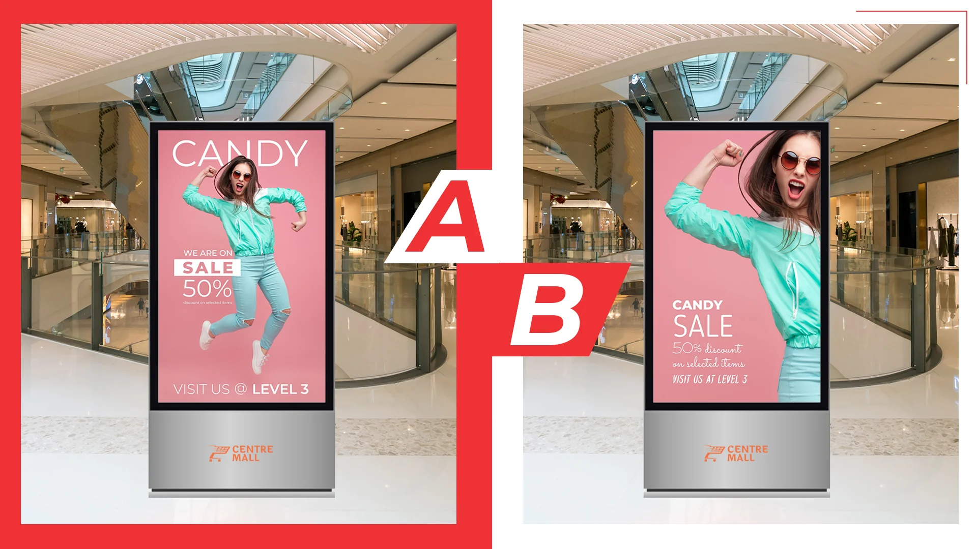
- Text size tells the audience the priority of the message. Larger text will automatically attract the eye and seem more important.
- Words should communicate a clear, concise message. Don’t clutter your designs with too much text. Avoid using more than three lines of text with five words each, OR five lines of text with three words each. Think headlines, not paragraphs.
7. Test and preview your content
Colours can convey powerful subconscious messages, and their meaning can also vary greatly depending on culture. Consider When designing content, you can become too familiar with it and start to become blind to potential failings in the design. Try to test your content in a real-world scenario. Test readability and visibility, and remember to view your content from a distance to ensure the message is clear. Ask yourself honestly: Is the message being conveyed effectively?
Let Scala help you create great digital signage content
Scala’s comprehensive digital signage solution includes access to Scala Designer, our flagship digital signage software that allows marketers across many global brand to produce polished, professional digital signage content at all levels.
Still not confident in your design skills? Learn more about Scala Software-as-a-Service and let us take care of your content creation and distribution with our managed SaaS model.
About the Author:
Scala digital signage experts share their experience and thoughts in our blog to provide practical tips and advice for real-world applications. Our team aims to offer interesting content through a variety of formats including long form articles, video logs, interviews and infographics.


